Fintech · Personal product · Product design
GoFinancial
An awareness-first expense tracker exploring how rapid manual logging can make everyday spending easier to remember and understand.
- Role
- Product Designer & Product Lead
- Client
- Personal Project
- Year
- 2026
Overview
The product in context.
A self-initiated product exploration centered on rapid expense capture and immediate daily spending awareness. V1 became an offline-first web PWA before an incomplete React Native exploration prompted a wider reassessment of scope and architecture.
The tension
The product challenge.
Cash purchases were easy to forget when logging was delayed. The challenge was to reduce the effort of recording spending while making each entry immediately useful through daily awareness.
Self-initiated fintech product
An awareness-first expense tracker built around one deliberately simple habit.
- problem
- Cash purchases recorded too late were easy to forget, creating an everyday awareness gap.
- hypothesis
- If expense entry requires very little time or thought, spending is more likely to be recorded while it is still remembered.
- role
- Product direction, UX, interaction design, and AI-assisted implementation review.
- platform
- Web PWA → React Native exploration.
- status
- Personal product exploration — paused for redesign.
- contribution
- Defined the product principles and requirements, reviewed implementation decisions, corrected hierarchy, and evaluated trade-offs.
Origin
I could remember spending money—or remember to record it—but not always both.
- body
- GoFinancial began with my own attempt to track daily expenses in a notebook. The approach worked only when I recorded a purchase immediately. If several days passed, smaller details became difficult to reconstruct: how much I spent, what I bought, and where cash had gone. Banking applications could show transactions that passed through an account, but they could not explain every cash purchase. The problem was therefore not primarily missing banking data. It was a gap in everyday awareness.
Product hypothesis
When friction disappears, consistency has a better chance to follow.
- principle
- Open → Log → Close. Make expense entry almost frictionless, then return the user directly to daily awareness.
- rationale
- Every additional field, screen, setting, and capability had to justify the friction it introduced. The hypothesis has not been validated through retention or behavior-change data.
Primary interaction
The product needed to connect capture and awareness in one short loop.
- finding
- Expense capture only became useful when a saved entry immediately changed the daily-awareness view.
- evidence
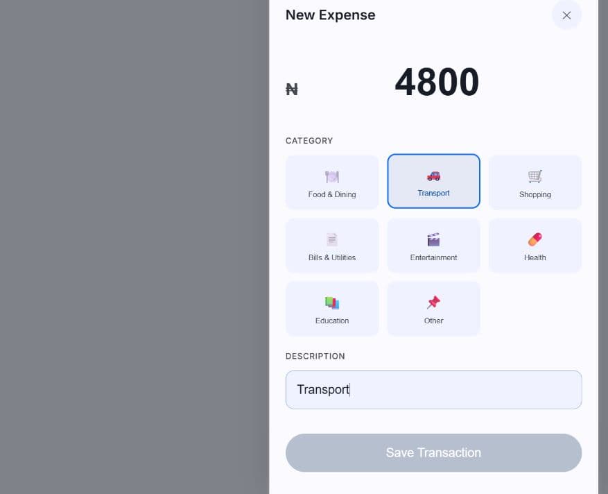
- The implemented loop is Quick Add → amount → category → optional note → save → updated daily total.
- implication
- Entry hierarchy, validation, and feedback should protect the path back to awareness rather than introduce additional setup.

Product decision 01
Awareness before automation.
01
Context
Bank applications already exposed account transactions, while the original awareness gap was strongest around cash spending.
02
Decision
Keep the MVP manual and awareness-first rather than introducing bank synchronization.
03
Why
Financial integrations would add setup, trust, security, and maintenance requirements before the central hypothesis had been tested.
04
Trade-off
Manual entry preserves simplicity and cash visibility, but asks the user to record each expense themselves.
Product decision 02
Quick Add needed to become the product’s centre.
01
Context
An early implementation treated Quick Add like a secondary feature.
02
Decision
Make the expense-entry action persistent, visually distinct, and immediately accessible.
03
Why
A functioning feature was not enough; the interface hierarchy needed to communicate the product’s actual priority.
04
Trade-off
Giving one action strong prominence reduces room for competing navigation and secondary capabilities.
Product decision 03
Categories turned individual entries into useful context.
01
Context
The original concept emphasized descriptions, while the AI implementation partner proposed structured categories.
02
Decision
Retain categories as a required part of expense entry.
03
Why
Categories gave individual records enough structure to support weekly comparisons and monthly spending breakdowns.
04
Trade-off
Selecting a category adds a step to the core loop, but produces more useful context later.
Information hierarchy
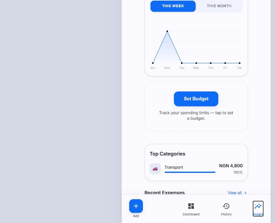
Daily, weekly, and monthly views answered different questions.
- finding
- A single transaction becomes more useful when the product provides progressively broader context.
- evidence
- V1 implements a prominent daily total, weekly spending visualization, and monthly/category aggregation.
- implication
- Start with one useful number, then reveal deeper context without forcing every user into a complex dashboard.
Designing for continuity
Offline was a product requirement, not a technical extra.
- finding
- Expense recording should not depend on connectivity because capture often happens in transitional moments.
- evidence
- The V1 repository implements IndexedDB, localStorage fallback, service-worker caching, and an offline-state banner.
- implication
- Storage architecture and offline feedback directly supported the product promise that an expense could be recorded when it happened.
Designing for continuity
Multi-currency was a global-use hypothesis, not validated traveler demand.
- finding
- Spending records should remain understandable when a person moves between currency contexts.
- evidence
- V1 includes multiple currency options, stored original-currency information, static conversion data, and converted-from provenance in the interface.
- implication
- Entry, storage, aggregation, and display must agree about what an amount represents; static rates must not be presented as live exchange data.
Designing for continuity
Local-first data still needed a route out of the product.
- finding
- Local-first storage should not make financial records permanently dependent on one interface.
- evidence
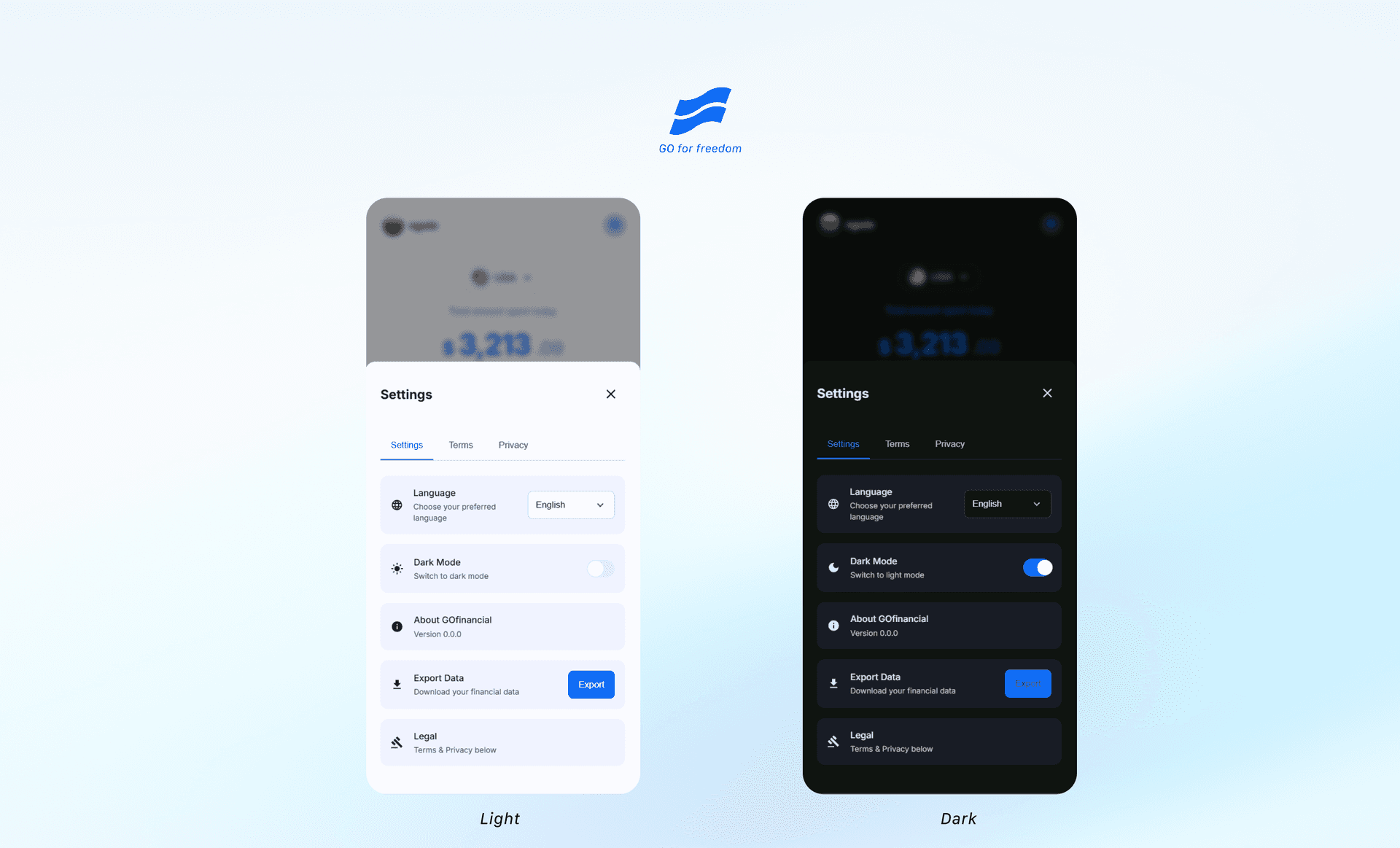
- The V1 Settings implementation generates downloadable CSV and printable HTML reports from stored transactions.
- implication
- Export created a portability and backup path, although the repository contains no evidence about how frequently it was used.
Implementation evidence
V1 became a working web PWA—but implementation breadth was not product validation.
- finding
- V1 proved that the product concept could be expressed as a substantial working web implementation.
- evidence
- The final committed repository contains transaction CRUD, calendar review, charts, budget states, export, IndexedDB/localStorage persistence, PWA caching, offline feedback, themes, and keyboard/ARIA/error-state implementation.
- implication
- The breadth demonstrates product and technical fluency, while the absence of user and business metrics keeps the outcome scoped to implementation and learning.
Architecture learning
A personal prototype is not automatically a multi-user financial product.
- finding
- The assumptions that supported a personal prototype did not match the requirements of a wider financial product.
- evidence
- V1’s local storage and local authentication architecture was centered on a personal, single-user context rather than production-grade ownership and isolation boundaries.
- implication
- A wider product would need explicit authentication, record ownership, user isolation, recovery, synchronization, deletion, and authoritative data boundaries.
Product evolution
The product started on the web, but the intended destination was a mobile application.
Specification
Principles before screens
The friction-first product rules, core loop, offline requirement, and design constraints were defined before the main implementation.
V1
Mobile-first web PWA
The web implementation explored capture, daily awareness, history, charts, export, themes, offline behavior, and interaction states.
Learning
Architecture and feature breadth
Considering wider use exposed the single-user assumption and the cost of expanding capability before validating repeat usage.
V2
React Native exploration
An Expo/React Native rewrite began to explore native distribution. It remains incomplete, has known engineering and UX issues, and is not presented as launched.
AI-assisted product development
AI accelerated implementation. It did not own the product decisions.
- task
- Turn product requirements and interaction ideas into tangible implementations that could be reviewed quickly.
- use
- ChatGPT supported product thinking and documentation; Antigravity/OpenCode supported exploration and engineering implementation.
- judgment
- I retained responsibility for hierarchy, prioritisation, trade-offs, and quality: correcting Quick Add prominence, accepting categories for aggregation, and rejecting/refining an inadequate chart direction.
- outcome
- The working loop was human direction → AI exploration or implementation → human evaluation → acceptance, rejection, or correction → verified product state.
Reflection
I added too much too early.
Expand capability early
Benefit: Made the prototype broad enough to explore charts, budgets, currencies, export, themes, recovery, and localization architecture.
Cost: Increased complexity before repeat usage established which supporting capabilities were necessary.
Protect the core loop
Benefit: Keeps product effort focused on rapid capture and immediate daily awareness.
Cost: Delays potentially useful secondary capabilities until evidence justifies them.
Decision: Restart with the narrower core loop, validate repeat usage earlier, and make every secondary capability earn its place.
What I would do differently
Building more is not the same as strengthening a product.
- body
- If I restarted GoFinancial today, I would protect Quick Add and the daily total, remove steps that do not contribute directly to capture or awareness, test repeat usage before expanding scope, define user and architecture assumptions earlier, and establish authentication, ownership, and isolation before wider distribution. The harder discipline is deciding what deserves to exist—and what should wait.
Future direction
Future exploration must remain narrower and evidence-led.
- Validate whether rapid manual logging is useful enough to repeat before expanding feature breadth.
- Resolve authentication, data ownership, user isolation, recovery, synchronization, and deletion requirements before wider distribution.
- Reassess which V1 capabilities genuinely support awareness before carrying them into a native redesign.
- Treat AI-assisted financial guidance strictly as future product exploration—not an existing feature, validated demand, regulated advice, or investment-performance capability.